 Contact Us
HTTPS websites account for 50% of Google Page-1 Results
Just over 9 months ago, there was a study conducted by Peter J. Meyers of Moz revealing that 30% of Page-1 Google Results were secure https. As of now, the data spiked to almost 50% i.e. half of the Page-1 Google results are now https. That’s a significant change in the number of https pages on the front page of Google Search results in a considerably short amount of time.
Earlier it was difficult to figure out whether is it due to the rankings boost or because there is an actual increase of https sites on the web. Well now it is clear that this hike in http sites is due to the sites switching rampantly to https as opposed to Google’s criteria favoring https sites. This will drive Google to increase its preference towards https as more and more sites are making the switch. But there are speculations that HTTP for Search Engine Optimization is mostly hype, but certainly that hype has turned into shocking reality with the increasing number of HTTPS sites on the web.
Now Peter J. Meyers haven’t dig out the reasons that led to this new Web Seo Boom. So Web Solution Centre, Website Designing Company in Delhi, took the liberty to curate some of those reasons for you.
Accelerated Mobile Pages (AMP)
The first and the foremost reason. Ever heard of the term? No, no worries!
Accelerated mobile pages is a technique designed to build faster mobile pages. It is giving the already mobile friendly pages an advantage of quicker loading by restricting the pages to the basic coding. Google’s another attempt to satisfy its search users. AMPs is an open source project/ platform build to ensure publishers enhance speed and readability of their mobile content pages. Accelerated mobile pages are build on basic or most appropriate HRML tags, in other words your mobile content pages are build on diet HTML, striking out those tags that render your site slower.
The benefits? Oh, there are plenty. Pages that load faster, have higher click through rates, more page views, less bounce rates, better onsite experiences which leads to Google’s reward of improving the ranking of that particular AMP page. You won’t be surprised to find AMP pages ranking higher than non-AMP’s. Well why not, if they are laced with myriads of benefits.
Earlier when AMPs came into picture, they are only focused on big news sites and became a real concern for web owners and SEOs. But Google clearly isn’t going to alleviate the burden for a large number of websites’ to adopt it.
Recently Google started presenting AMP results for recipe sites too, which was earlier directed to news websites and blogs.
And for an ecommerce website like Ebay (one of the founders of the AMP Project):
In case your site is already brimming with lots of visitors, it is advisable you start scheduling the creation of an AMP version.
This new trend is basically the root cause of one of the biggest changes in the history of SEO – Mobile First Indexing. This should now be a priority of every nature of site, be it a blog, a news site or a recipe site.
But there seem to be a minor glitch when it comes to E commerce sites implementing APM versions.
It is a real experiment to try to test the category and see if it is proven fruitful in terms of performance and ROI of creating an AMP version of an Ecommerce site. Google shares its own tips for using AMP for E commerce sites Not every function that is basic in E commerce site is compatible with AMP. Your more strategic option should be going PWA.
Resources about AMP
How To Get Started With Accelerated Mobile Pages (AMP)
SEO in 2017: Mobile optimization as a competitive advantage
8 things you need to know about Google AMP
SEO Benefits Of Accelerated Mobile Pages (AMP)
WordPress plugin for adding AMP support
wbAMP: Accelerated mobile pages for Joomla
Mobile-First Indexing
Yet another noose around our necks.
We have encountered many SEO changes over the years, big or small. But the biggest change of all, however, has been the mobile revolution and this further changed everything.
Google made a surprising announcement through its Google Webmaster’s blog about mobile-first indexing in November 2016, because they were trying to solve a problem.
Google’s ranking systems were always revolve around the desktops, no matter how many times or how many people were using Google on their mobile devices, which is almost everyone. This one step has however changed our mindset that revolves around optimizing search for desktop only, because now it’s only mobile or nothing.
This simply means that we have to go about making some drastic changes to our site if we want to even have a shot at ranking well.
Well does that mean we should completely neglect desktop search? Well by doing so you’ll be making a big mistake especially if you are a Ecommerce site.
The chart below, based on the Consumer Barometer with Google data, tells us clearly that desktop is still by far the most-used device for product research.
All Google is trying to tell us is that toady it is relevant to find a right balance in terms of site usability for both desktop and mobile.
Lets’ study in detail, what Mobile First Indexing is, what it looks for and how can you rank well by implementing it.
Why such sudden shift from Desktop-First to Mobile-First?
In case you haven’t noticed but mobile is now the new desktop.
According to official Google Statement, more than 50 percent of search queries globally now come from mobile devices.
A recent study by Hitwise unveils that in the US mobile search accounts for 58 percent of overall search query volume. The data is based on an average of 11 key categories and associated queries analyzed by Hitwise in its “Mobile Search: Topics and Themes” report.
The company “examined hundreds of millions of online search queries” covering PCs, smartphones and tablets between April 10 and May 7, 2016.
This set of data alone is reason enough to shift to a mobile-first indexing approach.
But this is not it. Earlier it is use to be that the mobile searches happened by people, while on the go or simply away from home. That is not the case anymore.
A full 77% of mobile searches now happen at home or work. Today people prefer to pick up a mobile phone for a quick search instead of sitting down at a desktop for firing up a tablet
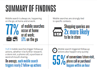
Source – http://digital-stats.blogspot.in/2013/04/77-of-mobile-searches-take-place-at.html
What do they do after the mobile search? They follow up obviously.
According to Digital-Stats, 75% of mobile searches produce at least two follow-up actions.
Furthermore giving heed to Mobile Search Stats 2013’s infographic 9 out of 10 mobile searches result in purchasing or visiting.
Technically all this mobile searching leads to real results, real action, and real revenue for millions of businesses.
They are not just statistics, it is happening in reality.
Mobile-First Index- Let’s Dig Deep
This was the official statement by the Google webmasters on Mobile First Index,
“To make our results more useful, we’ve begun experiments to make our index mobile-first. Although our search index will continue to be a single index of websites and apps, our algorithms will eventually primarily use the mobile version of a site’s content to rank pages from that site, to understand structured data, and to show snippets from those pages in our results. Of course, while our index will be built from mobile documents, we’re going to continue to build a great search experience for all users, whether they come from mobile or desktop devices.”
Mobile-first index entails what it actually sounds like. From now onwards Google will only consider those sites to rank in the Google that are Mobile optimized. Our years and years of attempts at making desktop optimized sites are all gone into bin.
In a nutshell, your site will rank well on both mobile and desktop, if it is Mobile optimized. And if by chance your site doesn’t perform well on mobile, it will sink both on desktop and mobile rankings.
But what if a site does not have a Mobile Version?
Google confirmed that in case if a website does not have any mobile version, it will index and consider for rankings its desktop one. And the same will be the case for the sites with an AMP version but no mobile version.
What Google is trying the sites to achieve with Mobile-First Indexing?
Designing a mobile version with any possible format: Pull up your socks, it’s high time the reality that the mobile version of your website is quintessential finally syncs with your other web priorities. Be it m.site, responsive, adaptive, PWA (progressive web pages, will talk it later). Even news sites now have a mobile version!
Making the content and pages optimized for both Mobile and Desktop alike: Know this you can lose your Google ranking, if your content and pages are not optimized for both mobile and desktop alike. As in if in desktop search we have perfectly oriented content and pages that were discarded in our mobile version, when mobile-first deploys, it will lose that SEO credibility. for this reason alone Google suggests responsive as the best solution.
Incorporating Structured data in our mobile versions: This fact usually takes a back seat in the interest of speed. Here are few steps you must take to make sure your mobile visitors are fully enjoying your content.
- Rethink your articles: A 3000-word long post looks great on a desktop, but on a mobile device it can be really intimidating. In case you want to post long blogs, try using short paragraphs and breaking those paragraphs up with media, like infographics and screenshots.
- Make Infographics an integral part of your mobile strategy: Infographics are shared and liked 3 times more than other content.
- Use multiple types of content: Audio and video work exceptionally well for mobile sites. A balanced combination of written content and audio and video can give your visitors a really good user experience.
Structuring a Mobile First strategy: Lots of site owners are still living in a desktop-first world. Not quite right. From website design to content to the marketing strategy everything is created with desktop in mind and then switch it over to mobile.
A study by Smart Insights revealed that, mobile Internet use makes up 51% of total Internet use. Mobile use has officially overtaken desktop use, and it’s important you know that too.
Progressive Web Apps (PWA)
I don’t know how many will agree with me, but this is for me the most trending topic for 2017, Progressive Web Apps (PWA)
Google has already started singing its song publicly via its Webmaster blog and developer website, also Googlers are informally suggesting it in conferences and private chats.
But there seem to be a minor glitch when it comes to E commerce sites implementing APM versions as we have discussed earlier.
Moreover, loading time represents another crucial factor that need to be considered while optimizing sites for mobile. Double click by Google in their new study, “The Need for Mobile Speed”, found that 53% of mobile site visits are abandoned if pages take longer than 3 seconds to load.
Additionally, sites that load in 5 seconds vs 19 seconds observed
- 25% higher ad view ability
- 70% longer average sessions
- 35% lower bounce rate.
We can’t let go of yet another addiction of Google, they crave for security and that comes with HTTPS, and…. PWA are only compatible with Https.
Now you can easily mesh these two facts and oversee where Google will going to push these sites in future, of course PWA.
Resources about PWA
A Beginner’s Guide To Progressive Web Apps