

 Contact Us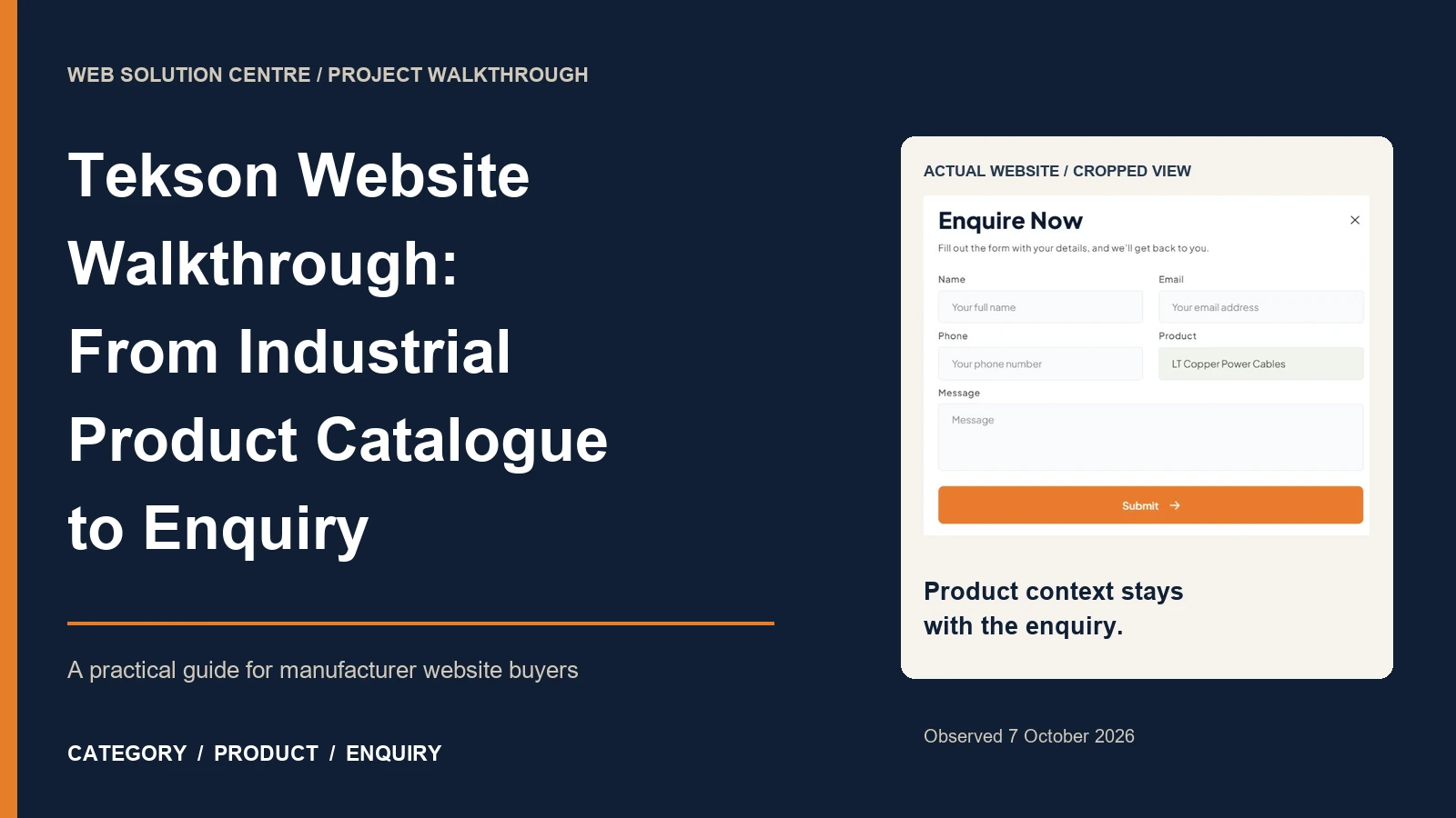
An industrial buyer can recognise a product photograph and still leave without knowing what to ask for. A catalogue website earns its usefulness in the gap between recognition and a specific enquiry: finding the right family, understanding the available information and carrying that context into a conversation.
The direct answer: a manufacturer website should connect categories, product information, downloadable documents and enquiry routes as one coherent journey. Tekson's public website provides a concrete example of that approach, with lessons for Indian manufacturers and distributors planning their own catalogue.
Tekson appears in Web Solution Centre's selected project portfolio, and its public site credits WSC in the footer. This walkthrough examines visible pages and controls observed on 7 October 2026. It does not claim private project scope, sales growth, conversion improvements or independently verified product performance. Recommendations below are our editorial analysis, rather than a reconstruction of an unpublished client brief.
Start with the industrial buyer's job
A catalogue serves several readers with different levels of certainty. A dealer may know the product family but need a current commercial reference. A contractor may recognise an application but need help narrowing the range. A procurement colleague may receive a product link from an engineer and need enough context to request a quotation.
Those are distinct tasks. Giving everybody the same brochure download can make the interface look simple while shifting the work onto the visitor. Equally, adding checkout controls before pricing, availability and fulfilment rules are ready can create expectations the business cannot reliably meet.
On the Tekson homepage, product categories sit alongside separate price-list, catalogue and dealer-enquiry routes. The useful lesson is the availability of different starting points. A visitor can begin with a range, a document or a business conversation.
For your own site, write three plain task statements before discussing visual style: “I need to locate a product family,” “I need information to compare an option,” and “I need someone to confirm the next commercial step.” Then identify the page and action that complete each task. This gives a website design brief a more testable purpose than “make the catalogue premium.”
Follow the category-to-product journey
The inspected route began at Cables. The cables category page presented named subcategories and a sidebar selector. Selecting Industrial Power Cables navigated to its own range page, where three product cards offered detail links. We then opened LT Copper Power Cables. This is a verified browsing sequence, not an assumption based on a screenshot of an unused control.
Use names that support recognition
The first design decision is vocabulary. Internal warehouse shorthand may make sense to a sales team but confuse a new purchasing assistant. Conversely, broad labels such as “Solutions” can hide distinctions that experienced buyers expect to see immediately.
Build the category list with both product knowledge and customer language. Ask the sales team which terms appear in genuine incoming requests. Where two terms refer to the same family, decide which is the main label and explain the alternative within the page. Avoid creating near-identical categories merely to accommodate every keyword variation.
Make every step recoverable
A product URL should be shareable on its own. Someone receiving that link in a purchasing conversation may never see the homepage. Show the product name, its family and a route back to related options. The visitor should not have to reconstruct the hierarchy from a browser's Back button.
The observed Tekson product page includes a breadcrumb trail and related-product links. For a new build, acceptance testing should include direct entry into a detail page, returning to the family and switching to an alternative. These small journeys reveal navigation weaknesses that a homepage presentation can conceal.
Make product information usable
The inspected product detail page combines imagery, a named product, descriptive text, a ready-stock range table and an enquiry action. The screenshot below records the information as displayed; stock labels and technical statements remain Tekson's claims. They are not a substitute for current supplier confirmation or engineering selection.
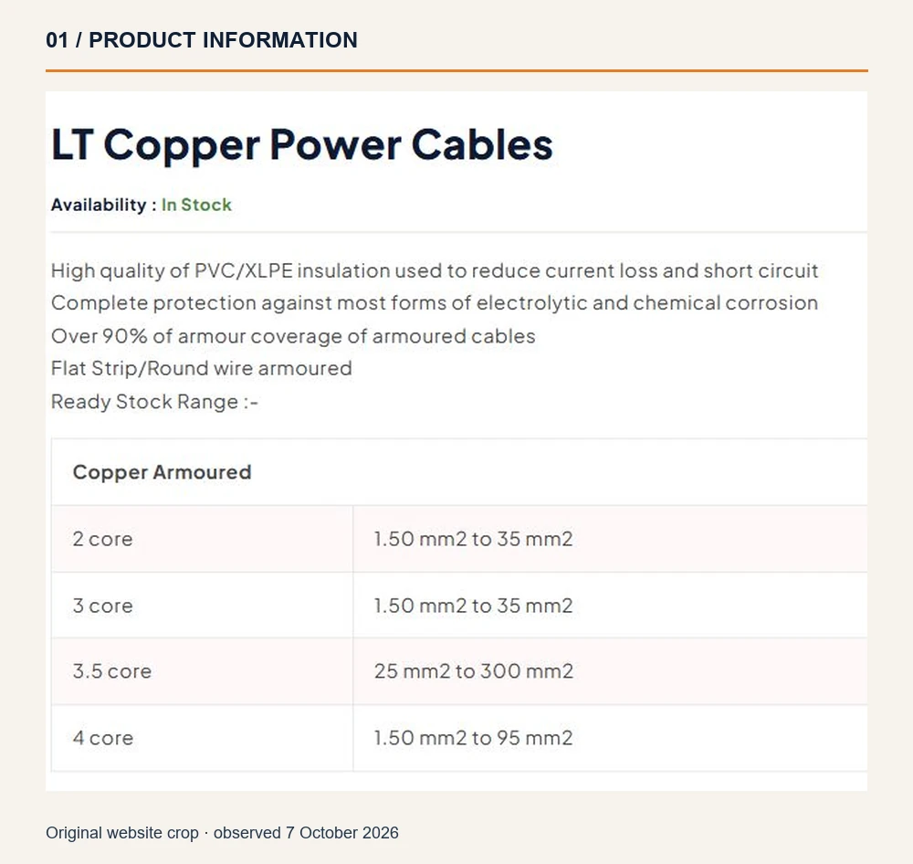
The transferable design principle is to separate information by purpose. A photograph supports recognition; a description explains the family; a structured table helps comparison; a contact action handles questions that the page cannot answer. None of those elements should be expected to do all four jobs.
Define a reusable content record
Before building hundreds of pages, agree a record for one representative product. It might include the approved name, reference code, family, images, verified characteristics, variants, document links, content owner and review date. The exact fields should follow the business's product range, rather than a generic ecommerce template.
Use consistent units and labels across records. Preserve meaningful differences between a product family, a variant and a stock-keeping unit. When information is unavailable, a clear request for confirmation is more useful than a guessed value. Do not let a designer fill technical gaps from an attractive competitor page.
A table also needs to remain understandable when copied into an email or viewed on a narrow screen. Give columns explicit headings and keep essential information in page text. A screenshot of a specification sheet may be useful supporting material, but it makes maintenance, copying and accessibility harder if it is the only version.
Give web pages and PDFs different jobs
Tekson offers a price list and a product catalogue as separate downloads. Both linked files returned HTTP 200 during this review. The price-list cover states August 2026. The catalogue filename refers to June 2024, while the inspected cover did not show a revision date. That filename alone cannot establish whether the document is currently approved.
This is a useful commissioning question: who controls document currency, and how does the website make it visible? A successful download proves access to a file. It does not prove that every commercial term, product reference or availability statement remains valid today.
| Resource | Main buyer task | Maintenance requirement |
|---|---|---|
| Category page | Recognise a family and narrow the route | Keep names and links aligned with the range |
| Product page | Review one option and prepare questions | Approve facts, variants and enquiry context |
| Catalogue PDF | Save or circulate a broader reference | Show an edition and review its contents |
| Price-list PDF | Consult a commercial reference | Confirm effective date and applicable conditions |
| Enquiry route | Request current confirmation or guidance | Assign ownership, routing and response handling |
For your own catalogue, show a meaningful edition or effective date beside the download. Consider displaying file size so a phone user can choose when to download a large document. Keep the essential product journey available in HTML; a visitor should not need to download the entire range merely to identify one item.
Document searchability and accessibility require their own review. Our PDF SEO checklist covers that separate work. Here, the practical priority is agreement between page content, downloadable references and the current information supplied by the sales team.
Preserve context when an enquiry opens
Opening Enquire Now on the inspected product page revealed a drawer containing name, email, phone, product and message fields. The product field was prefilled with LT Copper Power Cables. We opened and closed the interface without entering contact details or submitting a request; delivery and response behaviour were outside this observation.
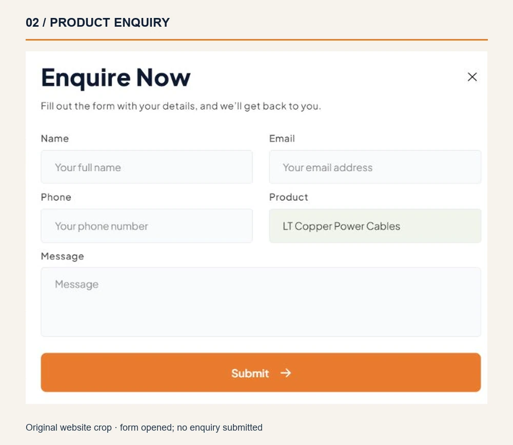
Prefilling relevant context can spare the buyer a repetition and give the recipient a clearer starting point. In a new implementation, consider carrying a stable product identifier and page URL alongside the readable name. Names may change; a dependable identifier helps the team understand which item the visitor actually viewed.
Ask only what the next step needs
A short form should still collect enough information for a useful reply. For an illustrative bulk enquiry, a message could state the required family, quantity or length, destination and requested timing. Those are example prompts for a future brief, not Tekson's published ordering requirements.
The W3C forms tutorial recommends clear labels, instructions and understandable feedback. Apply those principles to required fields, errors and confirmation messages. A visible field is not evidence that its accessible name, validation or keyboard behaviour has been tested.
Also define the business workflow. Which inbox receives the request? Who covers absences? How are duplicate messages handled? What is the agreed next step after submission? A polished drawer cannot answer those operational questions. Include them in the delivery scope and test submission only with the site's owner under an agreed procedure.
Separate dealer and product enquiries
A dealer considering a relationship and a contractor asking about one item need different conversations. The public dealer page describes the network and directs visitors to contact the company. The contact page provides location information, direct contact options and dealer-oriented content. We observed these routes without validating dealer counts or making contact.
For another manufacturer, make the distinction explicit in navigation and routing. A product enquiry can retain an item reference. A partnership enquiry may need territory, company information and the type of relationship sought. An existing dealer's support request may need a separate destination altogether.
Do not create extra forms simply because different departments exist. Start with the visitor's task, then route it internally. If one form serves several purposes, its subject choice should use language a customer understands, and the team should verify that each choice reaches the intended owner.
Similarly, location information should explain its role: sales office, registered address or manufacturing facility. A map link is useful only when the visitor understands where it leads. Avoid implying that every listed location accepts walk-in purchases or provides technical assistance unless the business confirms that service.
Check the mobile journey carefully
We inspected the menu and enquiry interface with a narrow browser viewport as well as the desktop route. The mobile navigation toggle exposed the main links, and the product enquiry remained available. This bounded check does not certify the experience across physical phones, browsers, zoom levels or assistive technologies.
For a commissioning business, a mobile acceptance test should follow a complete task. Begin at a category, locate a family, inspect a table, open an enquiry and return to the product. Then repeat from a directly shared product URL. Record where text becomes difficult to read or controls require awkward precision.
Test with the onscreen keyboard open. An enquiry drawer can appear comfortable before a user focuses a field and then lose much of its usable space. Confirm that the active field, error message, close control and final action remain reachable. Check that closing the drawer returns the person to an understandable place.
Allow for interruptions. A visitor may switch to a PDF, a message or a call before returning. Decide whether unfinished form input should be retained, and document the privacy implications. These details belong in practical website development requirements, where they can be demonstrated and accepted.
Build a sensible search foundation
The catalogue hierarchy should also make important pages discoverable through ordinary links. Google's link guidance explains the value of anchor elements with usable href destinations and descriptive link text. A clickable-looking control alone does not establish that a crawler can follow it.
For a manufacturer website, create clear routes from relevant categories to product pages. Do not rely exclusively on an internal search box to expose the range. Google's site-structure guidance describes how linked page relationships help it understand product websites. The underlying navigation lesson is useful even when a catalogue leads to enquiries rather than checkout.
Keep the search plan tied to actual buyer questions. A family page can explain the range; a product page can identify a specific item; an informational guide can answer a broader selection question. Avoid repeating the same city-and-product paragraphs across every URL. They can obscure the distinctions readers need.
Structured data must describe supported, visible facts. Review the applicable requirements before adding product markup, and do not invent a price, review score or stock status to satisfy a field. Google's product-snippet documentation also makes clear that eligibility does not guarantee a rich result. This walkthrough did not audit Tekson's schema or establish its search performance.
A separate technical SEO review should check indexability, canonical URLs and important page coverage against the intended catalogue. Keep that work connected to a useful browsing structure, with ownership of each page's purpose established first.
Plan catalogue maintenance before launch
Catalogue quality is an ongoing publishing responsibility. Product names change, ranges expand, documents acquire new editions and commercial information needs review. If nobody owns those updates, even an attractive site can gradually become a source of contradictory instructions.
Create a small approval workflow: a product owner supplies facts, an editor checks clarity, an authorised reviewer approves publication and a named person confirms document currency. Record the revision and review date. The workflow can be modest; its value comes from responsibility being explicit.
When replacing a document, check links from product pages, emails and saved references. Decide how visitors using an older URL should reach current information. Avoid quietly deleting a resource that existing customers may still need without providing an appropriate route or explanation.
Define measurements with the same care. Catalogue downloads, enquiry openings and completed enquiries represent different stages. A click on a phone link does not prove a connected call, and a submitted form does not establish a qualified opportunity. Report the observable event and let the sales team confirm the later outcome.
Capture only the analytics information needed for the agreed purpose. Keep contact details and free-text messages out of general analytics reports. A useful review can combine aggregate journey data with appropriately handled sales feedback, while distinguishing observed patterns from guesses about why visitors left.
Turn the lessons into a buyer brief
The following is an illustrative commissioning exercise, not an internal Tekson or WSC template. Choose one representative family and one product with enough approved information to demonstrate the journey. Ask the proposed team to show how it would work before agreeing the full catalogue scope.
- Audience: identify the main buyer and the task they arrive to complete.
- Range structure: supply approved family names and explain variant relationships.
- Product record: provide facts, units, images, references and document ownership.
- Enquiry context: specify what should travel from the product page into the request.
- Documents: assign edition dates, review responsibility and replacement handling.
- Acceptance: agree direct-entry, mobile, keyboard and submission tests.
- Maintenance: confirm who can update content and who approves material changes.
Use the demonstration to reveal scope, rather than merely approve colours. Does importing a spreadsheet include cleaning inconsistent product names? Who writes missing descriptions? Can staff update a range table? Is form delivery testing included? These questions change the real work behind a quotation.
Our website quotation scope worksheet provides a separate way to compare proposals. Keep the same representative journey in each discussion so that a simpler offer and a more complex offer can be assessed against the same business need.
Avoid common catalogue mistakes
- Making a PDF the only route: provide an understandable web journey before asking visitors to save the full range.
- Organising around internal departments: category names should help buyers recognise products.
- Publishing uncertain specifications: use approved information and identify what requires confirmation.
- Losing the product in the enquiry: preserve a readable name and a dependable reference.
- Treating a form opening as completion: verify validation, delivery and response ownership separately.
- Leaving document dates ambiguous: make currency visible and assign a reviewer.
- Reporting clicks as commercial results: distinguish interactions, submitted requests and qualified opportunities.
Use the launch checklist
Run this checklist with the business owner and delivery team. An unchecked item is a decision or task to resolve, not a reason to invent missing evidence.
- Can a new visitor identify the relevant family without opening every product?
- Does a direct product link provide enough context to stand alone?
- Are product facts, units, images and variant relationships approved?
- Are important tables usable on narrow screens and available as text?
- Do document editions agree with the information the team currently supplies?
- Does an enquiry preserve the intended item without exposing unnecessary data?
- Have labels, keyboard use, errors and confirmation messages been checked?
- Has an authorised test established delivery to the correct recipient?
- Can dealer, product and support requests reach an appropriate owner?
- Are essential product pages reachable through crawlable navigation?
- Is responsibility for future content and document updates recorded?
- Are measurement definitions clear enough to avoid overstating results?
Choose the right level of complexity
Tekson's observed category, product and prefilled-enquiry route gives website buyers something concrete to discuss. The strongest transferable lesson is continuity: each step should carry enough information into the next for a person to make progress.
That does not mean every manufacturer needs advanced search, checkout or a customer portal. A compact range may work well with carefully organised pages. A larger, frequently changing catalogue may justify richer filtering and integrations. Choose those features from documented buyer and operational needs, then verify them with representative tasks.
If you are commissioning an industrial website, discuss your catalogue and enquiry requirements with Web Solution Centre. Bring a representative product record, current documents and the questions your sales team actually receives. Those materials make it possible to design a useful journey and agree what a successful delivery must demonstrate.
Sources
Public pages and documents were reviewed on 7 October 2026. Screenshots are cropped observations of the live project. No enquiries were submitted, and no commercial or technical product claims were independently validated.