

 Contact Us
A food brand website has only a few seconds to answer four questions: what is the product, who is it for, why should a shopper trust it, and where can they buy it? The Jivaro Foods website offers a useful, real-world example of how a focused makhana brand can organise those answers into one coherent journey. Its restrained navigation, product-led imagery, origin story, nutrition section, reviews, policy links and direct shopping route keep attention on a single commercial proposition instead of making visitors decode a crowded catalogue.
The practical lesson is not to copy Jivaro's colours or layout. It is to build an ecommerce experience around the decisions a shopper must make. For Indian food and consumer brands, that means pairing visual appetite with clear product facts, putting reassurance close to purchase intent, and making every important page reachable without a search box. This case study examines the public website as it appeared on 2 October 2026 and translates observable design choices into a reusable brief for business owners.
Evidence note: Web Solution Centre's portfolio identifies Jivaro Foods as a website project and links to the live site. This article discusses only public, observable elements of that site. It does not claim access to Jivaro's analytics, sales, conversion rate, private brief, budget or commercial results, and it does not independently verify product, nutrition or customer-review claims displayed by the brand.
Contents
- The case-study snapshot
- The design challenge for a focused food brand
- What the homepage communicates well
- How the shopping journey is structured
- What business owners should take from it
- The technical and search foundation
- A reusable food-brand website brief
- Common mistakes to avoid
- Launch and improvement checklist
- Balanced conclusion
The Jivaro Foods case-study snapshot
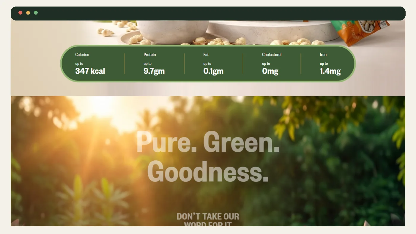
At the time of review, the live Jivaro Foods website presented premium makhana as its signature product. The visible top-level journey included Shop, Nutrition and Reviews, together with account and cart controls. The homepage then moved through a product promise, a sourcing-and-processing story, nutrition information, customer-review content, a featured product block and standard company and policy links.
| Observable website choice | What it helps a shopper answer | Transferable lesson |
|---|---|---|
| A small top-level menu | Where do I shop, learn about nutrition or review social proof? | Give priority actions permanent, obvious routes. |
| Large product-led hero imagery | What is this product and what kind of brand is this? | Let the product category be recognisable before decoration takes over. |
| Origin and processing narrative | Why should I believe the product is considered rather than generic? | Turn broad brand values into concrete, reviewable statements. |
| Nutrition and review sections | Is there enough information and reassurance to continue? | Place proof in the path, but label and substantiate every claim. |
| Featured product with a Buy Now route | What exactly can I purchase next? | End storytelling with a specific action, not a vague brand message. |
| Privacy, terms, shipping and refund links | What happens to my data, order and return? | Operational reassurance belongs in the commerce experience. |
This sequence is especially relevant to a focused or single-product brand. A large marketplace may need deep categories, filters and search. A young food brand with one main proposition has a different problem: it must make a narrow range feel intentional, credible and easy to buy.
The design challenge for a focused food brand
A product such as makhana is familiar to many Indian shoppers, but familiarity does not remove the need for explanation. A premium brand must distinguish its offer from an unbranded commodity without burying the purchase route under lifestyle language. It also needs to serve visitors who arrive with different levels of awareness: one may already want to buy, another may be comparing snacks, and another may first want to understand sourcing, ingredients or delivery terms.
That creates four simultaneous design jobs.
1. Establish the category immediately
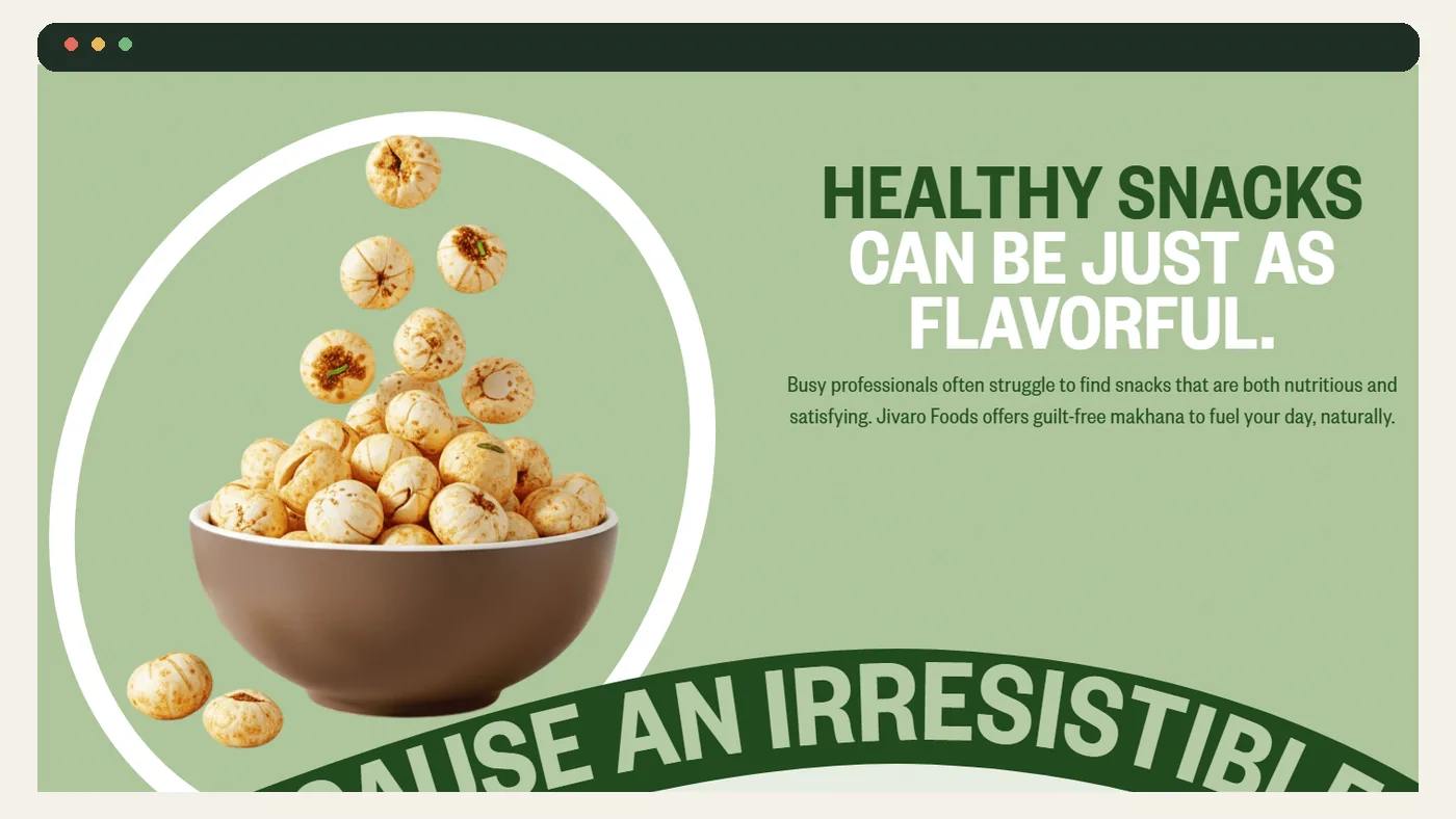
Beautiful imagery is valuable only if people recognise what is being sold. The reviewed homepage uses a bowl of makhana, product packs and a direct food-focused headline. The visitor is not asked to interpret an abstract wellness montage. For a packaged-food site, this basic clarity is commercially important: product type, format and intended occasion should be visible before the visitor scrolls far.
2. Explain why this version is different
Premium positioning needs evidence. Jivaro's public copy discusses farmers in Mithila, harvesting, processing, preservatives, testing and nutrition. Those statements create a structure for differentiation. The design lesson is to pair each broad promise—quality, purity, responsibility or convenience—with precise supporting content and, where appropriate, documentation. A claim should not become stronger merely because it appears in large type.
3. Build confidence without interrupting momentum
Food shoppers may consider ingredients, allergens, nutrition, pack size, price, delivery, refunds and payment confidence. If these answers are scattered or unavailable until checkout, uncertainty accumulates. A sensible information architecture surfaces the most important facts on the product page, links to deeper policies and keeps the add-to-cart action available when the shopper is ready.
4. Preserve brand character on mobile
Editorial typography, curved graphics, motion and full-bleed images can create distinction, but they must survive narrower screens and slower connections. The right question is not whether an effect looks impressive on a designer's monitor. It is whether product meaning, navigation, price and the primary action remain readable and operable on a mid-range phone.
What the homepage communicates well
The visual system has a recognisable product world
Sage and forest greens, cream backgrounds, warm food photography and organic curves create continuity from hero to product presentation. More importantly, the makhana remains the visual subject. For brand owners, consistency should be defined as a system—palette, type scale, photography treatment, spacing, button styles and product-card rules—not as a single beautiful hero banner.
This is where an experienced website design process earns its value. The designer is not decorating isolated screens; the work is to translate positioning into repeatable components that still communicate when content, products or devices change.
The navigation reflects actual visitor questions
Shop, Nutrition and Reviews correspond to three high-intent questions: what can I buy, what is in it, and what reassurance is available? About and Contact appear in the footer, where they remain accessible without competing with shopping actions at the top. That hierarchy is appropriate for a focused store, although a broader range would eventually need categories, search and possibly filters.
Google's guidance on ecommerce site structure reinforces the technical side of this principle: products intended for discovery should be reachable through crawlable links, not only through a site-search box or script-driven interaction. Good navigation serves shoppers and crawlers at the same time.
The page alternates promise and proof
The reviewed sequence does not present product imagery, origin, nutrition and reviews as unrelated modules. It alternates an emotional promise with information that can support a decision. That rhythm is useful: attract attention, answer a question, introduce the next reason to continue, then offer a clear route to shop.
There is also an editorial caution. Nutrition figures, health-related language, sourcing statements and testimonials need internal substantiation and appropriate legal review. The design can make evidence easier to understand, but it cannot substitute for evidence. A responsible brief identifies who approves product claims, when they expire, and where supporting records are kept.
How the shopping journey is structured
The homepage offers more than one route to the shop: a persistent Shop link, a featured product area and a Buy Now action. This reduces dependence on a single button. The product block also combines a name, short positioning statement, visible price and product image before the next action. These are the minimum ingredients of a meaningful commerce prompt.
For a working store, however, the complete journey must be assessed beyond the homepage:
- Discovery: a visitor recognises the product and chooses Shop or a featured item.
- Evaluation: the product page supplies accurate images, pack or variant details, price, availability, ingredients, nutrition, delivery information and returns context.
- Commitment: add-to-cart feedback is clear, quantity can be checked, and the cart does not hide important charges or conditions.
- Checkout: forms are labelled, validation is understandable, payment choices are credible, and the final total is unambiguous.
- After purchase: confirmation, support and order-status expectations are easy to find.
A homepage can start this journey beautifully and still lose people later. That is why an ecommerce website design engagement should test the whole path, including error states, empty carts, out-of-stock variants and slow mobile connections—not just the presentation layer.
Seven lessons for food and consumer-brand buyers
1. Write the decision path before the wireframe
List the questions a cautious first-time buyer will ask, then assign each answer to a page or component. If ingredients belong on the product page, do not leave them only in a downloadable brochure. If delivery coverage affects purchase, do not wait until the last checkout step. The wireframe should follow the decision path, not an agency's favourite layout.
2. Separate brand claims from verified product facts
“Premium” is positioning. Pack weight, ingredients, allergens, price, stock, nutrition and dispatch terms are factual fields that require an owner and update process. Treat them differently in the content model. This makes future edits safer and reduces the chance that a stylish landing page contradicts the store, label or merchant feed.
3. Design a system that can grow
A single product may later gain sizes, flavours, bundles or gifting formats. Decide early how variants, categories, unavailable items and related products will work. The site should not need a visual redesign every time the catalogue changes. Reusable product cards and structured fields make growth less fragile.
4. Budget for original product photography
For food, texture, scale, packaging and usage context are part of the buying experience. A useful shot list may include front and back pack views, product close-ups, serving scale, ingredients, lifestyle use and images for multiple aspect ratios. Compress images for the web without making labels unreadable, and reserve layout dimensions to prevent shifting as they load.
5. Make proof inspectable
Testimonials should be authentic and permission-cleared. Certifications or laboratory statements should identify what was tested and remain current. Sourcing claims should be specific enough for a reader to understand. A trust badge with no context is weaker than a short, accurate explanation linked to evidence.
6. Plan ownership and maintenance
Before approval, clarify who owns the domain, hosting, analytics, source code, product data, photography and merchant accounts. Agree who updates stock, prices, policy pages and seasonal campaigns. The price-free worksheet in WSC's guide to comparing website design quotations can help buyers compare these responsibilities rather than looking at headline cost alone.
7. Measure the funnel, not the visual applause
Useful events might include product views, add-to-cart, checkout start, completed purchase, coupon errors and contact requests. Interpret them with context. A change in conversion rate can reflect traffic mix, pricing, stock, offers or seasonality as well as design. No agency should promise that a colour, animation or redesign will guarantee sales.
The technical and search foundation behind the experience
A credible storefront needs implementation discipline beneath the art direction. This is where design, web development and search requirements have to meet in one acceptance plan.
Crawlable product architecture
Every product intended for search should have a stable URL and be reachable through ordinary links. Categories should link to their products; important products can also be featured from the homepage or editorial content. Avoid making JavaScript-only search the sole discovery route. Keep canonicals, internal links and XML sitemaps consistent.
Accurate Product and Offer data
Google's current merchant listing documentation describes Product and Offer properties used to understand price, availability, shipping and returns. Markup must match what shoppers can see and purchase on the page. Eligibility does not guarantee a rich result, and fabricated ratings or stale availability create both customer and search risk.
Where appropriate, structured data and a Merchant Center feed can complement one another. Google's guide to sharing product data explains the two routes. The operational lesson is simple: maintain one reliable source of product truth, then keep the page, markup and feed aligned.
Accessible images and controls
Product images need useful alternatives when they convey information. Decorative flourishes can use empty alt text. Icon-only cart, account and menu controls need accessible names and keyboard operation. The W3C's image accessibility tutorial distinguishes informative, decorative and functional images; that distinction should be part of the content-entry guide, not fixed after launch.
Performance budgets
Large photography, custom fonts, video and scroll animation can be expensive on mobile. Define budgets for hero media, total page weight and third-party scripts; serve responsive images; lazy-load below-the-fold media; reserve dimensions; and test on real mid-range devices. Use field data when available and lab tools for diagnosis. A fast blank template is not the goal—an understandable, stable and responsive buying journey is.
Launch controls and monitoring
Google's guidance for launching an ecommerce site includes ownership verification, indexing requests or sitemaps and monitoring indexing. Add merchant-feed checks, structured-data validation, order tests, payment failure tests, analytics validation and backups. WSC's technical SEO service can be relevant when the store needs crawl, rendering and structured-data review alongside design.
A reusable website brief for a focused food brand
Use the following outline when requesting proposals. It is deliberately outcome-neutral: it defines the work to inspect without promising sales.
Business and audience
- What products are live now, and what variants or categories are expected within twelve months?
- Who buys, for which occasions, and what questions delay a first purchase?
- Which regions can be served, and what delivery or payment constraints apply?
- Which claims have documentary support and who approves them?
Content and commerce
- Required product fields: title, pack size, ingredients, allergens, nutrition, price, availability and storage guidance.
- Photography list and usage rights for product, packaging, lifestyle and source imagery.
- Pages for story, contact, FAQs, privacy, terms, shipping, returns and any required food disclosures.
- Cart, checkout, tax, shipping, coupon, payment, confirmation and support flows.
Design and accessibility
- Approved identity assets, colour contrast, type hierarchy and responsive breakpoints.
- Keyboard access, focus states, labels, errors, alt-text rules and reduced-motion behaviour.
- Reusable components for products, reviews, proof points, FAQs and editorial stories.
- Mobile acceptance tests on agreed real devices and connection conditions.
Technical ownership
- Platform, hosting, environments, backups, security updates and incident responsibility.
- Domain, analytics, Search Console, Merchant Center and payment-account ownership.
- Product data source, structured data, feeds, sitemap, redirects and canonical rules.
- Handover documents, training, warranty, maintenance scope and change-request process.
A proposal should map deliverables to these items. If a line says only “SEO included” or “mobile responsive,” ask what will be implemented, tested and handed over. For a scoped discussion, use the WSC contact page and bring this checklist to the first call.
Common mistakes to avoid
Letting the campaign concept hide the product
A dramatic hero can still fail if the shopper cannot identify the product, price or next action. Review the page without sound, animation or campaign context. The basic proposition should remain clear.
Publishing claims before the evidence process exists
Do not use design to amplify an unapproved health, nutrition, origin, environmental or customer claim. Record the source, owner and review date for every sensitive statement.
Building only the happy path
Test empty carts, declined payments, invalid addresses, delayed stock updates, expired coupons, broken images and support routes. These states shape trust as much as the homepage.
Treating mobile as a reduced desktop
Check reading order, tap targets, sticky controls, image crops, menu labels, keyboard overlap and checkout forms. Remove effects that obscure information or consume disproportionate data and battery.
Hiding essential content in images
Ingredients, nutrition, prices and terms should be available as readable HTML wherever practical. Text embedded only in an image is harder to update, translate, search and access.
Launching without a content owner
A store can become inaccurate even when the code is sound. Assign responsibility for product data, policies, proof, inventory, analytics and technical maintenance before launch.
Food-brand website launch and improvement checklist
- Confirm the hero names or clearly shows the product category and primary audience.
- Keep the main navigation aligned with high-intent questions and actions.
- Give every sellable product a stable, crawlable URL.
- Display accurate product, price, availability, pack, ingredient and delivery information.
- Verify every nutrition, sourcing, certification and testimonial claim.
- Make policy and contact routes easy to find before checkout.
- Use original, rights-cleared photography in appropriate aspect ratios.
- Add descriptive alt text to informative images and accessible names to controls.
- Keep visible product data, Product markup and merchant feeds consistent.
- Test cart, checkout, payment failure, confirmation and support on mobile.
- Set performance budgets for images, fonts, animation and third-party scripts.
- Verify analytics events without collecting unnecessary personal data.
- Back up the site and document domain, hosting, code and account ownership.
- Monitor indexing, structured-data issues, stock accuracy and checkout errors after launch.
Conclusion: design the evidence and the action together
The public Jivaro Foods website is useful because its core structure is legible. A visitor sees a recognisable product, encounters a focused brand story, can review nutrition and customer-oriented reassurance, and is repeatedly given a route towards the shop. The aesthetic is distinctive, but the more transferable achievement is alignment between message, information hierarchy and action.
That does not prove commercial performance, nor does it mean every brand should use the same long-scroll format. A larger catalogue may need deeper categories and search; a regulated product may need more prominent disclosures; a returning customer may value speed over storytelling. The correct design depends on audience, product range, evidence and operational reality.
For buyers, the standard should be straightforward: ask the design team to show how each page helps a real person recognise, evaluate, trust and purchase the product. Then require the technical foundation, content ownership and testing needed to keep that promise true after launch. That is a stronger brief than “make it premium,” and it gives both the business and the agency something concrete to verify.
Sources
- Jivaro Foods live website — public website observations captured 2 October 2026.
- Google Search Central: Help Google understand your ecommerce website structure.
- Google Search Central: Merchant listing structured data.
- Google Search Central: Share your product data with Google.
- Google Search Central: How to launch an ecommerce website.
- W3C Web Accessibility Initiative: Images tutorial.